- Home
- About
- Portfolio
- Interactive Portfolio
- 3D App for Local Govt
- UI/UX Designs
- All UI/UX Designs
- PTV Design System
- Journey Planner
- Tram and Tram Stop
- V/Line Train and Coach
- Uplift Timetable Search
- TW Design System
- Future of Disruptions
- Low Floor Tram
- Mode Preference
- Global Search Design
- Help and Support Page
- Capacity Indicator
- Memento Media
- Community Project
- Improving Map UI/UX
- 3d Product Viewer
- Character Animation
- Website Designs
- Transport
- All Stages of Tunnelling
- All Stages of Building
- Animation
- Digital Signage
- EDM
- iPad Stand Design
- City of Boroondara
- Yellow
- Contact
- Design Services
UI/UX Designs
PTV Design System
DESIGN SYSTEM FOR PTV WEBSITE AND APP
I developed and managed the Design System for Public Transport Victoria (PTV), a prominent brand. The design system, created using the atomic design methodology, played a crucial role in supporting both the PTV website and app. It was utilized by more than 50 internal and external stakeholders, including UX and UI designers, product owners, and business analysts.
The PTV Design System is quite intricate, featuring complex components for journey planning tools, myki, and content management. Its purpose is to provide a standardized and efficient framework for design and development, ensuring consistency and usability across various platforms and interfaces.

I created PTV design system, keeping atomic design methodology in mind. So the components starts from atom/tokens, such as typography (font style/size), colour, icons, spacing, grid system, layout, symbols, transitions etc.

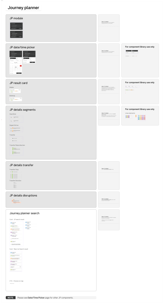
The journey planning tools in the PTV Design System are pretty complicated. Adding lots of different factors while keeping things responsive was tough. Here’s an example of what a regular page in the design system looks like.

Components
Components are often created with multiple variables. Designers can simply toggle on and off/select a dropdown options to change components to meet their need.

Super Components
Coming up with a clever solution for a really complicated set of parts was one of the challenges. Let me show you an example of a myki component I made. With just one component, we managed to create more than 50 different versions. That’s why we nicknamed it a “Super Component.” Not every component gets to wear a cape, but this one sure does!

Documentation
Without proper documentation, a design system might not work well. That’s why I made sure to document all components with guides on “How to” for both designers and developers. I also created extra documents on Confluence and linked them with the design system to provide more information.

design fast with PTV DS
Since all the components are made with different versions and adhere to brand guidelines, it’s easy and fast for designers to pick a template and kick off a project. I also made sure to focus on accessibility at the component level, ensuring that all designs are accessible to everyone.

Accessible
It might be a bit complicated, but making it accessible was non-negotiable. There’s no room for compromise when it comes to accessibility.
Quick Links
PTV Design System, Multimodal Journey Planner, Accessible Tram/Tram Stop on Map, V/Line Train and Coach, Uplift Timetable Search, TW Design System, Future of Disruptions, Low Floor Tram Indicator, Mode Preference UI, Global Search, Help and Support, Capacity Indicator, Memento Media, Community Project, Improving Map UI/UX
Contact
Melbourne, Victoria
a[email protected]
0431 310 211
Availability
Monday – Friday
Philosophy
“Never say no. Nothing is impossible”
- Home
- About
- Portfolio
- Interactive Portfolio
- 3D App for Local Govt
- UI/UX Designs
- All UI/UX Designs
- PTV Design System
- Journey Planner
- Tram and Tram Stop
- V/Line Train and Coach
- Uplift Timetable Search
- TW Design System
- Future of Disruptions
- Low Floor Tram
- Mode Preference
- Global Search Design
- Help and Support Page
- Capacity Indicator
- Memento Media
- Community Project
- Improving Map UI/UX
- 3d Product Viewer
- Character Animation
- Website Designs
- Transport
- All Stages of Tunnelling
- All Stages of Building
- Animation
- Digital Signage
- EDM
- iPad Stand Design
- City of Boroondara
- Yellow
- Contact
- Design Services