- Home
- About
- Portfolio
- Interactive Portfolio
- 3D App for Local Govt
- UI/UX Designs
- All UI/UX Designs
- PTV Design System
- Journey Planner
- Tram and Tram Stop
- V/Line Train and Coach
- Uplift Timetable Search
- TW Design System
- Future of Disruptions
- Low Floor Tram
- Mode Preference
- Global Search Design
- Help and Support Page
- Capacity Indicator
- Memento Media
- Community Project
- Improving Map UI/UX
- 3d Product Viewer
- Character Animation
- Website Designs
- Transport
- All Stages of Tunnelling
- All Stages of Building
- Animation
- Digital Signage
- EDM
- iPad Stand Design
- City of Boroondara
- Yellow
- Contact
- Design Services
UI/UX Designs
Multimodal Journey Planner
Redesigning a multimodal Journey Planner for PTV
The Department of Transport is shifting to becoming an integrated transport department. Reflecting the wider remit, the department recognises there will be a need to allow users to plan journeys across multiple modes of transport.
Now, let me explain each step of how we designed this project using Human-Centered Design (HCD).
Competative analysis
I began by looking at what other transportation services are doing. This is called a competitive analysis. I checked out 13 different competitors, including Google, Apple, Transport Denmark, and Transport NSW. The goal was to figure out what features are common and what would be nice to include in our project.

Ideation session
We organized a design jam where the design team came together for a brainstorming session. We shared lots of ideas and came up with beautiful sketches and innovative concepts. The session was full of creativity, and I gathered plenty of ideas to kickstart my work on low-fidelity designs.

Prototype 01
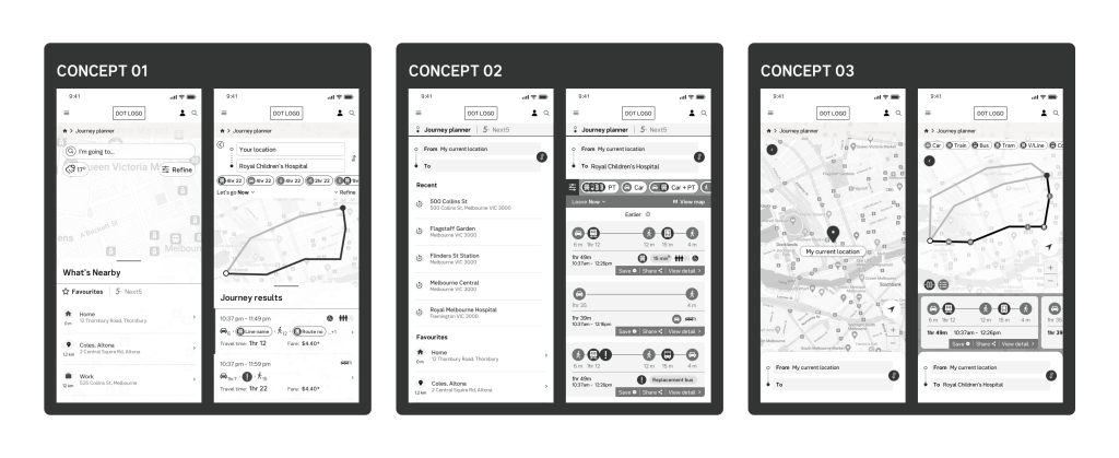
After several rounds of tweaking, I came up with three different concepts, and we took them for user testing. In Concept 01, both the map and listings share equal importance. Concept 02 places more emphasis on the listings. Finally, Concept 03 gives priority to a large map. Each concept offers a unique approach, and user testing will help us understand which one works best for our audience.
Round 02 and 03
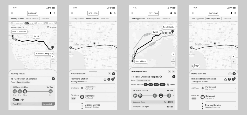
I collected feedback from the user testing and made several rounds of design improvements. Afterward, we conducted another round of user testing. Feeling confident that we had gathered enough data to guide our final design decisions, I began working on finalizing design.
Final design
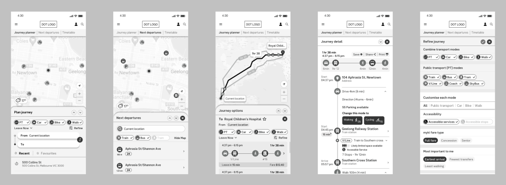
I created a clean and straightforward design where users have the power to choose whether they see a map or a list. In addition to a comprehensive multimodal journey planner, we considered users who prefer not to use a journey planner. Some people just want to know when and where the next departure is without much fuss.
Our journey planner is unique because users can select public transport, car, bike, or walking. Users have detailed control to mix or change modes. The planner even provides information about how crowded the service is, whether it’s wheelchair accessible, and much more. It’s a one-of-a-kind tool that puts users in control.
Presentation
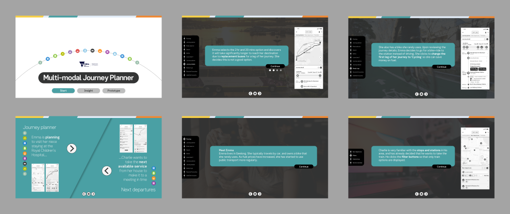
After completing this fantastic project, we had the opportunity to deliver an engaging interactive presentation. We showcased our work to the entire department and received excellent feedback. The positive response added the finishing touch to a successful and rewarding project.
Quick Links
PTV Design System, Multimodal Journey Planner, Accessible Tram/Tram Stop on Map, V/Line Train and Coach, Uplift Timetable Search, TW Design System, Future of Disruptions, Low Floor Tram Indicator, Mode Preference UI, Global Search, Help and Support, Capacity Indicator, Memento Media, Community Project, Improving Map UI/UX
Contact
Melbourne, Victoria
a[email protected]
0431 310 211
Availability
Monday – Friday
Philosophy
“Never say no. Nothing is impossible”
- Home
- About
- Portfolio
- Interactive Portfolio
- 3D App for Local Govt
- UI/UX Designs
- All UI/UX Designs
- PTV Design System
- Journey Planner
- Tram and Tram Stop
- V/Line Train and Coach
- Uplift Timetable Search
- TW Design System
- Future of Disruptions
- Low Floor Tram
- Mode Preference
- Global Search Design
- Help and Support Page
- Capacity Indicator
- Memento Media
- Community Project
- Improving Map UI/UX
- 3d Product Viewer
- Character Animation
- Website Designs
- Transport
- All Stages of Tunnelling
- All Stages of Building
- Animation
- Digital Signage
- EDM
- iPad Stand Design
- City of Boroondara
- Yellow
- Contact
- Design Services