- Home
- About
- Portfolio
- Interactive Portfolio
- 3D App for Local Govt
- UI/UX Designs
- All UI/UX Designs
- PTV Design System
- Journey Planner
- Tram and Tram Stop
- V/Line Train and Coach
- Uplift Timetable Search
- TW Design System
- Future of Disruptions
- Low Floor Tram
- Mode Preference
- Global Search Design
- Help and Support Page
- Capacity Indicator
- Memento Media
- Community Project
- Improving Map UI/UX
- 3d Product Viewer
- Character Animation
- Website Designs
- Transport
- All Stages of Tunnelling
- All Stages of Building
- Animation
- Digital Signage
- EDM
- iPad Stand Design
- City of Boroondara
- Yellow
- Contact
- Design Services
UI/UX Designs
Improving Map User Experience for PTV website and App
Summary
The initiative to improve the Map User Experience on the PTV website and app underscores a commitment to enhancing the overall navigation and usability for users. Through thoughtful redesigns and feature enhancements, the goal is to create an intuitive and user-friendly map interface that caters to a diverse range of user needs. This includes optimizing map responsiveness, refining the presentation of transportation routes, and integrating user-friendly features for seamless exploration. By prioritizing clarity and ease of use, the improved Map User Experience seeks to empower users with a more efficient and enjoyable journey planning process, aligning with PTV’s dedication to providing a top-tier transportation platform.

Map update
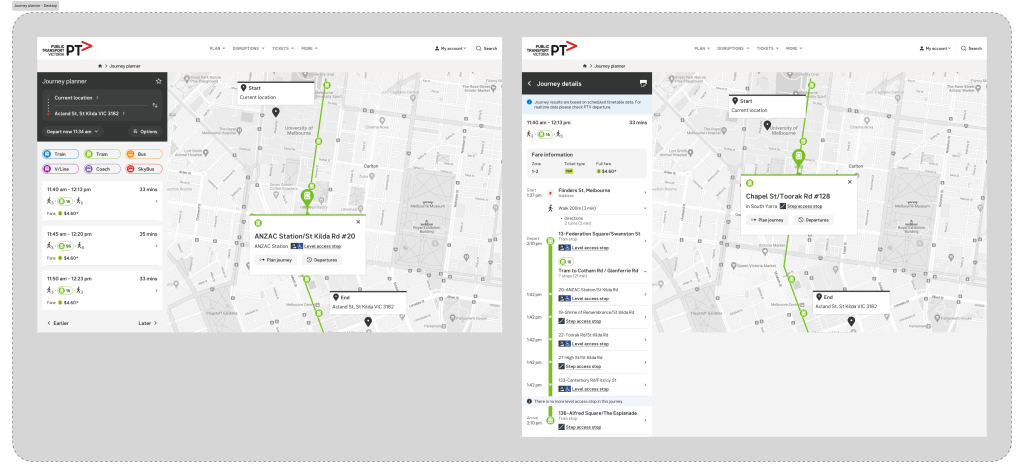
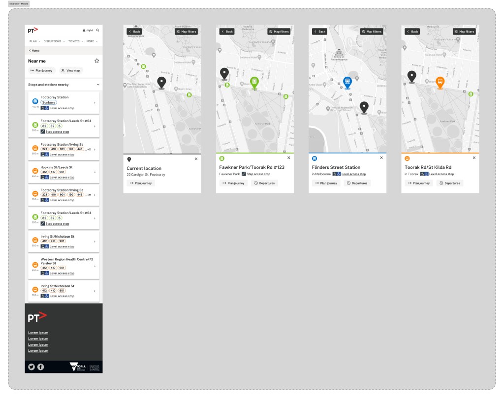
As part of the effort to enhance accessible tram and tram stop information on the map, I seized the opportunity to elevate the overall map user experience. This involved introducing a scalable modal, designed to improve the interaction and functionality of the map. The modal not only addresses specific accessibility needs but also contributes to a more intuitive and user-friendly map interface, ensuring a seamless and scalable experience for users navigating the PTV platform.

Journey planner
Here are screens for Journey planner


Service Overview
Here are screens for Service overview


Near me
Here are screens for Near me

Quick Links
PTV Design System, Multimodal Journey Planner, Accessible Tram/Tram Stop on Map, V/Line Train and Coach, Uplift Timetable Search, TW Design System, Future of Disruptions, Low Floor Tram Indicator, Mode Preference UI, Global Search, Help and Support, Capacity Indicator, Memento Media, Community Project, Improving Map UI/UX
Contact
Looking forward to hearing from you
Contact
Melbourne, Victoria
a[email protected]
0431 310 211
Availability
Monday – Friday
Philosophy
“Never say no. Nothing is impossible”
- Home
- About
- Portfolio
- Interactive Portfolio
- 3D App for Local Govt
- UI/UX Designs
- All UI/UX Designs
- PTV Design System
- Journey Planner
- Tram and Tram Stop
- V/Line Train and Coach
- Uplift Timetable Search
- TW Design System
- Future of Disruptions
- Low Floor Tram
- Mode Preference
- Global Search Design
- Help and Support Page
- Capacity Indicator
- Memento Media
- Community Project
- Improving Map UI/UX
- 3d Product Viewer
- Character Animation
- Website Designs
- Transport
- All Stages of Tunnelling
- All Stages of Building
- Animation
- Digital Signage
- EDM
- iPad Stand Design
- City of Boroondara
- Yellow
- Contact
- Design Services